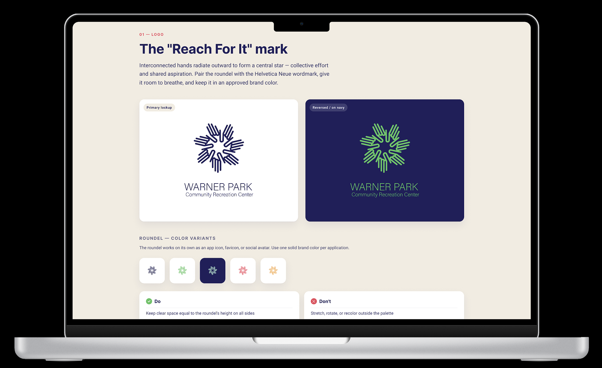
The "Reach For It" mark
Interconnected hands radiate outward to form a central star — collective effort and shared aspiration. Pair the roundel with the Helvetica Neue wordmark, give it room to breathe, and keep it in an approved brand color.
Concept overview & vision
The visual identity for the Warner Park Community Recreation Center stems directly from the core philosophy of the "Reach For It" initiative. The logo is engineered to communicate aspiration, inner potential, and community empowerment. Rather than acting as a static symbol, the design serves as a dynamic, forward-looking marker that commemorates the physical expansion of the center and its vital role in fostering long-term community growth.
Community engagement & audience alignment
The design speaks directly to its primary audience — diverse youth aged 11–17, local residents, and center users. Balancing a clean, contemporary typographic layout with a universal symbol of human connection, it reflects the neighborhood's diversity through the multi-layered hand graphic, uplifts youth voices by capturing the energetic spirit of local teens and their collaborative input, and offers daily encouragement as a highly scannable reminder of shared aspirations that welcomes every visitor.